SyllabusAide
🎓 SyllabusAide – Helping Students Discover Courses & Syllabi Across Ohio Universities
Project Type: UX/UI Design
Role: UX/UI Designer
Team: Collaborative effort with backend developers and content creators
Tools Used: Figma, Adobe Illustrator, Tailwind UI, Google UX Principles, CapCut
🔍 The Challenge
Students often struggle to find detailed course syllabi, materials, or instructor information across different university platforms. The process is scattered, outdated, and confusing. Our goal was to create one unified, simple-to-use platform where students could search, browse, and explore full course syllabi across Ohio universities.
💡 UX Approach – From Concept to Clarity
We followed a user-centered design process, inspired by Design Thinking principles:
Empathize
We started by interviewing students and academic staff to understand their frustrations:
• “I never know what materials I’ll need until the course starts.”
• “Every department has a different system for sharing syllabi.”
• “I want to compare courses easily.”
We mapped these pain points into a user journey to highlight key moments of friction.
Define
We defined our core users:
• Undergraduate & graduate students
• Course planners and advisors
• Curious learners exploring new topics
Then we created personas and distilled key user needs:
• Central access to syllabi
• Easy comparison between similar courses
• Clear, consistent design
Ideate
We sketched and brainstormed different layouts for:
• Course search filters
• Course cards
• Syllabus content display
• Instructor and material overviews
We explored UI patterns from platforms like Coursera, Notion, and Google’s Material Design to stay modern but accessible.
UI Design – Clean, Friendly, and Functional
Based on our UX findings, we built high-fidelity mockups in Figma using the latest UI trends:
• Soft gradients and clean white space for focus and readability
• Friendly illustrations to humanize the experience
• Card-based layout for scalable and consistent design
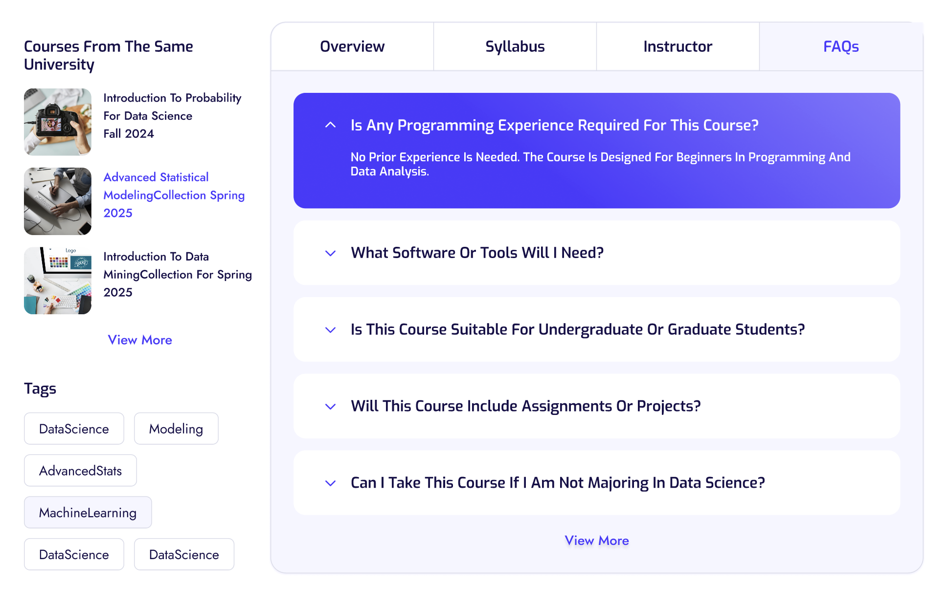
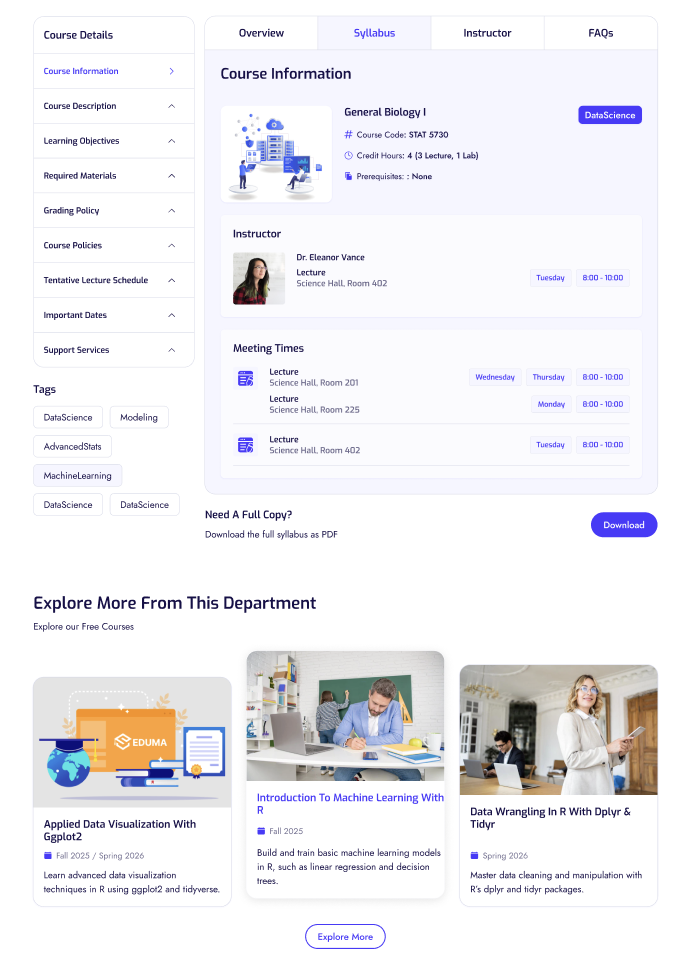
• Sticky tabs to allow smooth navigation between Overview, Syllabus, Instructor, and FAQs
• Tags and Filters to easily find relevant content by topic, course code, or university
We used Tailwind UI as a base, but customized the components to match our unique brand.
Collaboration
This project was a true collaborative experience. I worked closely with:
• Developers to ensure components were scalable and responsive
• Content editors to make sure the copy was student-friendly
• Design peers to test and critique usability
We held multiple review sessions to test the design and refine the experience.
Key Features
• 🔍 Advanced Search Filters by course, city, department, and code
• 📘 Full Syllabus View including materials, policies, and grading
• 🧑🏫 Instructor Profiles with office hours and course lists
• 📊 Grading Breakdown + Tools Required
• 📥 PDF Download Option for offline access
Outcome
The design was well received in usability tests. Students found it:
• Easy to use
• Visually appealing
• Extremely helpful for planning their semester
Final Thoughts
Designing SyllabusAide reminded me how much clarity and accessibility matter in educational tools. By focusing on real student needs and using a clean, modern design, we turned a frustrating process into a delightful one.