
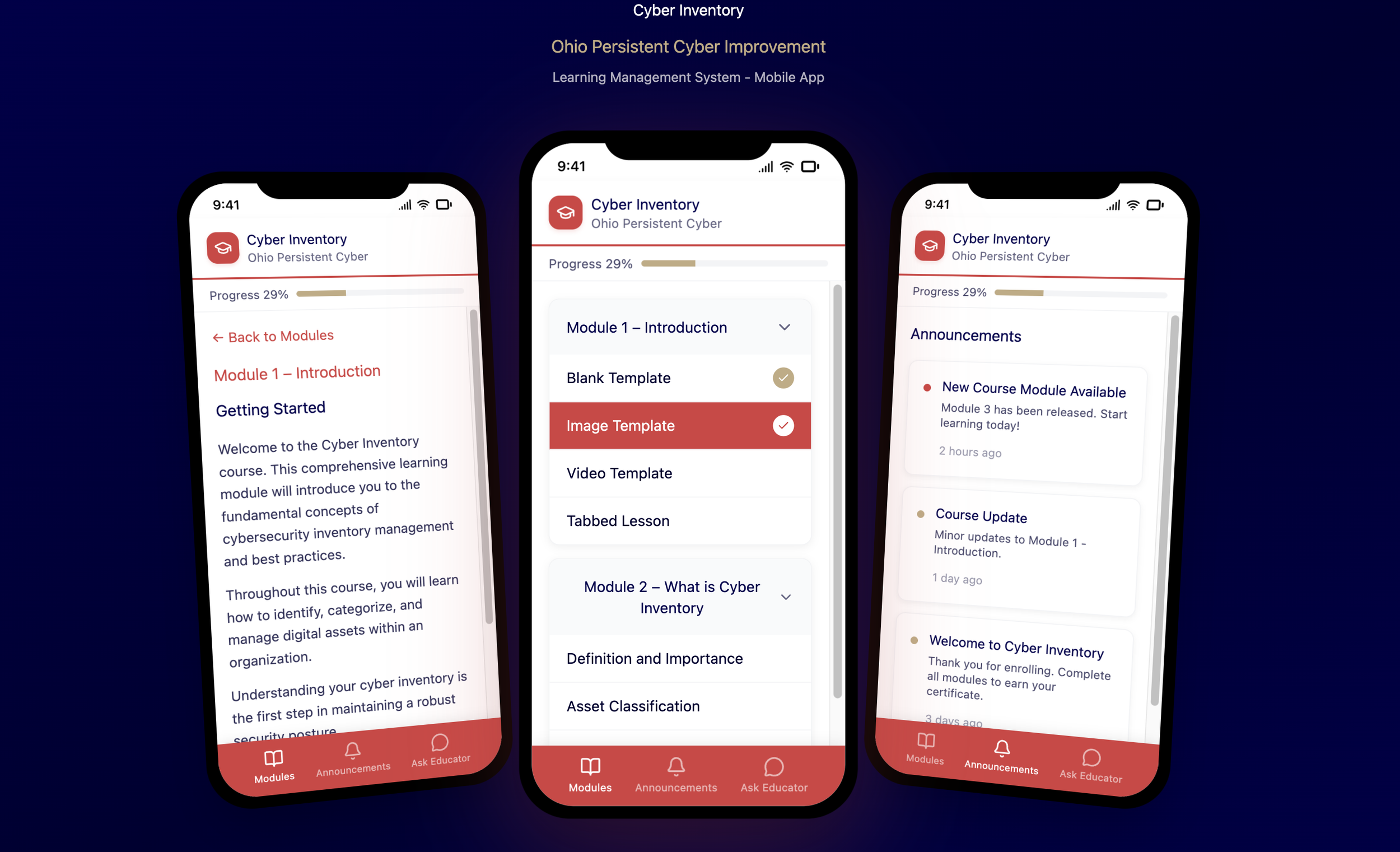
📱 Mobile Navigation Redesign
🧩 Problem
In the mobile version of the system, navigation was inefficient and inconsistent.
The top menu and sidebar were not optimized for small screens — users had difficulty accessing course content and returning to previous pages during lessons.
🔍 Research & Analysis
I began by analyzing competitor and similar products to identify best practices and common UX issues.
Through this competitive analysis, I discovered that:
• Students needed constant access to the course menu even while reading a lesson.
• The absence of a clear back button made returning to previous sections confusing.
• The sidebar and top bar overlapped or behaved inconsistently in different views.
These findings guided my redesign decisions and helped define clear UX goals.
⸻
💡 Solution
To improve the experience, I redesigned the navigation flow with three main focuses:
1. Persistent access to the course menu in the mobile view.
2. Adding a back button in a consistent and intuitive position.
3. Adaptive behavior of the top bar and sidebar to ensure smooth transitions between sections.
After sketching and validating low- and high-fidelity wireframes, the final interface was implemented entirely using Figma AI prompts — without manual drawing tools.
This allowed me to focus more on structure, clarity, and usability rather than pixel-level adjustments.
⸻
✅ Result
Usability testing showed that:
• Users navigated between lessons faster and with fewer errors.
• The navigation felt more natural and fluid, especially in mobile mode.
• The new layout significantly reduced confusion during interaction.
⸻
🧠 Reflection
This was my first experience designing an interface entirely through AI prompts.
Using Figma AI helped me explore how prompt-based design can accelerate iteration while maintaining UX quality.
It was a great balance between research-driven thinking and modern AI-powered execution.
